mirror of
https://github.com/Azure/cosmos-explorer.git
synced 2025-07-05 19:43:51 +01:00
 861042c27e
[Preview this branch](https://cosmos-explorer-preview.azurewebsites.net/pull/762?feature.someFeatureFlagYouMightNeed=true) The main change in this PR fixes the snapshot functionality in the Publish pane-related components. Because the code cell outputs are now rendered in their own iframes for security reasons, a single snapshot of the notebook is no longer possible: each cell output takes its own snapshot and the snapshots are collated on the main notebook snapshot. - Move the snapshot functionality to notebook components: this removes the reference of the notebook DOM node that we must pass to the Publish pane via explorer. - Add slice in the state and actions in notebook redux for notebook snapshot requests and result - Add post robot message to take snapshots and receive results - Add logic in `NotebookRenderer` to wait for all output snapshots done before taking the main one collating. - Use `zustand` to share snapshot between Redux world and React world. This solves the issue of keeping the `PanelContainer` component generic, while being able to update its children (`PublishPanel` component) with the new snapshot. Additional changes: - Add `local()` in `@font-face` to check if font is already installed before downloading the font (must be done for Safari, but not Edge/Chrome) - Add "Export output to image" menu item in notebook cell, since each cell output can take its own snapshot (which can be downloaded) 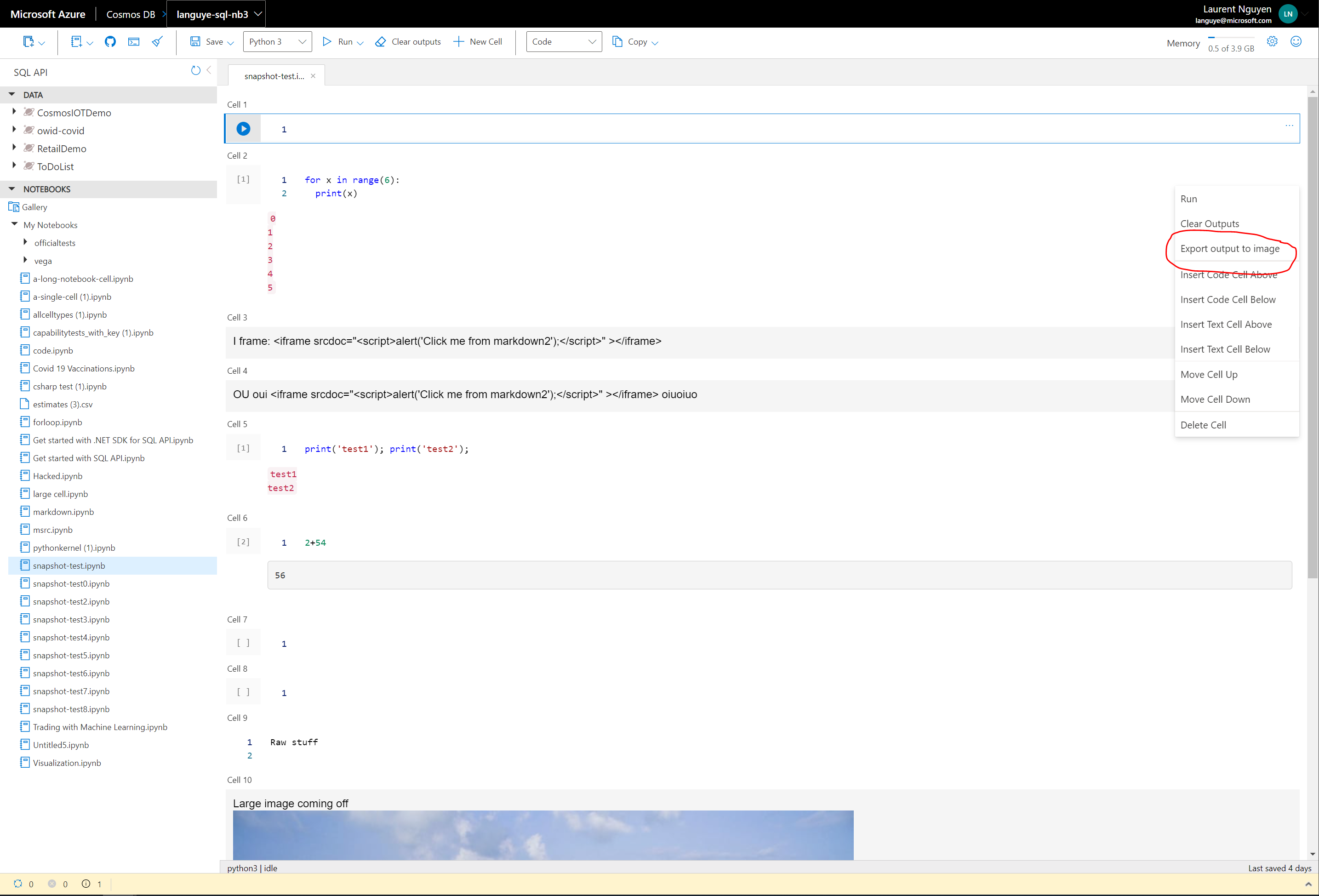
305 lines
7.5 KiB
Plaintext
305 lines
7.5 KiB
Plaintext
/******************************************************************************
|
|
FONTS
|
|
/******************************************************************************/
|
|
|
|
@font-face {
|
|
font-family: wf_segoe-ui_normal;
|
|
src: local("Segoe UI"), url("../../fonts/segoe-ui/west-european/normal/latest.woff");
|
|
}
|
|
|
|
@DataExplorerFont: wf_segoe-ui_normal, "Segoe UI", "Segoe WP", Tahoma, Arial, sans-serif;
|
|
@SemiboldFont: "Segoe UI Semibold", "Segoe UI", "Segoe WP", Tahoma, Arial, sans-serif;
|
|
|
|
@xSmallFontSize: 4px;
|
|
@smallFontSize: 8px;
|
|
@mediumFontSize: 12px;
|
|
@DefaultFontSize: 14px;
|
|
@largeFontSize: 16px;
|
|
|
|
/******************************************************************************
|
|
COLORS
|
|
/******************************************************************************/
|
|
|
|
@AccentMediumHigh: #0058ad;
|
|
@AccentMedium: #004e87;
|
|
@AccentHigh: #1ebaed;
|
|
@AccentExtraHigh: #55b3ff;
|
|
@AccentLow: #edf6ff;
|
|
@AccentMediumLow: #ddeefe;
|
|
@AccentLight: #eef7ff;
|
|
@AccentExtra: #ddf0ff;
|
|
|
|
@SelectionHigh: #b91f26;
|
|
@BaseLight: #ffffff;
|
|
@BaseDark: #000000;
|
|
@NotificationLow: #fff4ce;
|
|
@NotificationHigh: #f9e9b0;
|
|
@Purple1: #8a2da5;
|
|
@Dirty: #9b4f96;
|
|
|
|
@BaseLow: #f2f2f2;
|
|
@BaseMediumLow: #e6e6e6;
|
|
@BaseMedium: #cccccc;
|
|
@BaseMediumHigh: #767676;
|
|
@BaseHigh: #393939;
|
|
|
|
@BoxShadow: rgba(118, 118, 118, 0.65);
|
|
@GreyOutOpacity: 0.65;
|
|
|
|
@DefaultFontColor: @BaseHigh;
|
|
@DividerColor: @BaseMedium;
|
|
|
|
@InfoPointerColor: #3b3b3b;
|
|
|
|
@ErrorColor: @SelectionHigh;
|
|
|
|
@SelectionColor: #3074b0;
|
|
|
|
@FocusColor: #605e5c;
|
|
|
|
@GalleryBackgroundColor: #fdfdfd;
|
|
|
|
//Icons
|
|
@InfoIconColor: #0072c6;
|
|
@WarningIconColor: #db7500;
|
|
@ErrorIconColor: #b91f26;
|
|
|
|
/******************************************************************************
|
|
METRICS
|
|
/******************************************************************************/
|
|
|
|
@SmallSpace: 4px;
|
|
@DefaultSpace: 8px;
|
|
@MediumSpace: 12px;
|
|
@LargeSpace: 16px;
|
|
|
|
@ButtonBorderWidth: 1px;
|
|
@RightPaneWidth: 440px;
|
|
@RightPaneMinHeight: 565px;
|
|
|
|
@PaneLoaderWidth: 110px;
|
|
@PaneLoaderHeight: 10px;
|
|
|
|
@ButtonIconHeight: 18px;
|
|
|
|
@ScaleFormWidth: 280px;
|
|
|
|
@ImgWidth: 14px;
|
|
@ImgHeight: 14px;
|
|
|
|
@toggleFontWeight: 700;
|
|
|
|
//Resource Tree
|
|
@TreeLineHeight: 17px;
|
|
|
|
//top command bar height
|
|
@topcommandbarheight: 36px;
|
|
|
|
//Global Loader
|
|
@LoaderHeight: 6px;
|
|
@LoaderWidth: 24px;
|
|
|
|
//HDE constants
|
|
@HdeAccountSplitterHeight: 20px;
|
|
@AccountNavigationImgWidth: 350px;
|
|
@AccountNavigationImgHeight: 190px;
|
|
@AccountNavigationExpandCollapseSize: 12px;
|
|
|
|
// Query Stats
|
|
@IETableDataWidth: 650px;
|
|
|
|
//New Colleciton Pane textbox width
|
|
@newCollectionPaneInputWidth: 300px;
|
|
@tooltipTextWidth: 280px;
|
|
@sharedCollectionThroughputTooltipTextWidth: 150px;
|
|
@mongoWildcardIndexTooltipWidth: 150px;
|
|
@addContainerPaneThroughputInfoWidth: 370px;
|
|
@optionsInfoWidth: 210px;
|
|
@noFixedCollectionsTooltipWidth: 196px;
|
|
@ThroughputInfoWidth: 215px;
|
|
@ThroughputRuInfoWidth: 175px;
|
|
@RenewAccessInfoWidth: 115px;
|
|
@ErrorDetailsInfowidth: 145px;
|
|
@AccessKeyInputWidth: 370px;
|
|
@provisionDatabaseThroughputInfo: 200px;
|
|
|
|
//tabs container
|
|
@ActiveTabHeight: 31px;
|
|
@ActiveTabWidth: 141px;
|
|
@TabsHeight: 30px;
|
|
@TabsWidth: 140px;
|
|
@StatusIconContainerSize: 18px;
|
|
@LoadingErrorIconSize: 14px;
|
|
@ErrorIconContainer: 16px;
|
|
@ErrorIconWidth: 3px;
|
|
|
|
//form errors
|
|
@FormErrorWidth: 320px;
|
|
@WarningErrorIconSize: 32px;
|
|
|
|
// z-index
|
|
@Loader_z-index: 5; //this should be higher than that of the splitter to disable it
|
|
@NotificationConsole_z-index: 2;
|
|
|
|
@screen: screen\0;
|
|
|
|
// CommandBar
|
|
@CommandBarButtonHeight: 40px;
|
|
|
|
/**********************************************************************************
|
|
Common Flex Property
|
|
/**********************************************************************************/
|
|
|
|
.flex-display(@display: flex) {
|
|
display: ~"-webkit-@{display}";
|
|
display: ~"-ms-@{display}box"; // IE10 uses -ms-flexbox
|
|
display: ~"-ms-@{display}"; // IE11
|
|
display: @display;
|
|
}
|
|
|
|
.flex-direction(@direction: column) {
|
|
-webkit-flex-direction: @direction;
|
|
-ms-flex-direction: @direction;
|
|
flex-direction: @direction;
|
|
}
|
|
|
|
/*************************************************************************************
|
|
High contrast mode active
|
|
**************************************************************************************/
|
|
|
|
@media all and (-ms-high-contrast: none), (-ms-high-contrast: active) {
|
|
.selectedRadio,
|
|
.selectedRadio:hover,
|
|
.selectedRadio:active,
|
|
.selectedRadio.dirty,
|
|
.tab [type="radio"]:checked ~ label,
|
|
.tab [type="radio"]:checked ~ label:hover {
|
|
-ms-high-contrast-adjust: none;
|
|
-webkit-text-fill-color: HighlightText;
|
|
color: HighlightText;
|
|
border-color: HighlightText;
|
|
background-color: Highlight;
|
|
}
|
|
|
|
.queryMetricsSummaryTuple {
|
|
th,
|
|
td {
|
|
&:nth-child(2) {
|
|
width: @IETableDataWidth;
|
|
}
|
|
|
|
&:nth-child(3) {
|
|
width: 50%;
|
|
}
|
|
}
|
|
}
|
|
}
|
|
|
|
/********************************************************************************************
|
|
Common Hover and Active color
|
|
*********************************************************************************************/
|
|
|
|
.hover() {
|
|
background-color: @AccentLight;
|
|
}
|
|
|
|
.active() {
|
|
background-color: @AccentExtra;
|
|
}
|
|
|
|
.focus() {
|
|
outline: 1px dashed @FocusColor;
|
|
}
|
|
|
|
/************************************************************************************************
|
|
Common Toggle Switch
|
|
*************************************************************************************************/
|
|
@ToggleHeight: 30px;
|
|
@ToggleWidth: 180px;
|
|
|
|
.toggleSwitch() {
|
|
max-width: 100%;
|
|
margin-bottom: @SmallSpace;
|
|
padding: @SmallSpace;
|
|
cursor: pointer;
|
|
color: @BaseHigh;
|
|
font-weight: 400;
|
|
font-size: @mediumFontSize;
|
|
font-family: @DataExplorerFont;
|
|
}
|
|
|
|
.selectedToggle() {
|
|
border-bottom: 2px solid @BaseHigh;
|
|
}
|
|
|
|
.unselectedToggle() {
|
|
color: @AccentMediumHigh;
|
|
}
|
|
|
|
/********************************************************************************************************
|
|
Common Data Explorer Icons
|
|
*********************************************************************************************************/
|
|
.dataExplorerIcons() {
|
|
cursor: pointer;
|
|
width: @ImgWidth;
|
|
height: @ImgHeight;
|
|
}
|
|
|
|
/*********************************************************************************************************
|
|
Info Tooltip
|
|
**********************************************************************************************************/
|
|
.infoTooltip() {
|
|
position: relative;
|
|
display: inline-block;
|
|
}
|
|
|
|
.tooltipText(@textColor: @BaseLight, @backgroundColor: @BaseHigh) {
|
|
visibility: hidden;
|
|
background-color: @backgroundColor;
|
|
color: @textColor;
|
|
position: absolute;
|
|
z-index: 1;
|
|
left: @MediumSpace;
|
|
padding: @MediumSpace;
|
|
}
|
|
|
|
.tooltipTextAfter(@color: @BaseDark) {
|
|
content: "";
|
|
position: absolute;
|
|
right: 100%;
|
|
border-style: solid;
|
|
border-color: transparent @color transparent transparent;
|
|
left: 0px;
|
|
width: 0;
|
|
height: 0;
|
|
border-color: @InfoPointerColor transparent;
|
|
}
|
|
|
|
.tooltipVisible() {
|
|
visibility: visible;
|
|
}
|
|
|
|
.inputTooltip() {
|
|
position: relative;
|
|
}
|
|
|
|
.inputTooltipText(@textColor: @BaseLight, @backgroundColor: @BaseHigh) {
|
|
background-color: @backgroundColor;
|
|
color: @textColor;
|
|
position: absolute;
|
|
z-index: 1;
|
|
padding: @MediumSpace;
|
|
}
|
|
|
|
.inputTooltipTextAfter(@color: @BaseDark) {
|
|
content: "";
|
|
position: absolute;
|
|
right: 100%;
|
|
border-style: solid;
|
|
border-color: transparent @color transparent transparent;
|
|
left: 10px;
|
|
width: 0;
|
|
height: 0;
|
|
border-color: @InfoPointerColor transparent;
|
|
}
|